Experimenting with iMovie ’08.

16 02 2009

I believe that iMovie ’08 is one of the worst programs ever developed by Apple. I can’t even describe the amount of trouble that me and my classmates ran into with this program on one of our other projects. However, this project was easier to work with. I had to film an object that was over-the-top gross for a pure minute and 30 odd seconds. I then had to add to all the nasty titles, transitions, and effects just to make the whole video insanely nasty.


Obsession with Urban Outfitters.

16 02 2009

Over 300 pictures were taken and found from anything remotely associated with Urban Outfitters. Most of these images are my own, but some were found on by searching on the internet and I even captured screenshots from Urban’s website. After collecting all the images, sound was added. Each picture displays itself for half a second where nearly all the sound clips last the same amount of time. The sounds and images are placed together so they can coexist in an environment together; this creates a relationship with one another. Overall the project was very time consuming because iMovie ’08 can be difficult to work with.


Paper Adventure.

16 02 2009

First project made in my digital video class. I had to crumble up a piece of paper and take shots of it moving around. The paper ended up becoming part of the environment in which i photographed it in, creating its own personality and daily routine.


Gui Borchert: Letter for the “Spelling Change” project and Words of Change

3 02 2009

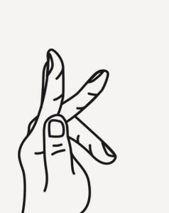
The letter K comes from the Greek kappa, which was taken from the Semitic kap, the symbol for an open hand. This design depicts a hand forming the letter K. It symbolizes the open hand America and the world have been waiting for, for so long. A hand to guide us into a better, brighter, fairer future.” ¹

With new president elect, Barack Obama, the people of America are promised that there will be change. Gui Borchert who has produced work for Nike, MTV, and Comedy Central has also developed designs for Obama. “Letter for the “Spelling Change” project” represents basically a promising future for America. “Words of Change” is essentially an image of typography that comes together, both small and large type, to configure a portrait of Obama.

“From the moment I heard about the possibility of Barack Obama running for president, I knew something extraordinary was about to happen. Hope was back in the eyes of not only a nation but the entire world. And the closer we get to this dream becoming a reality, the more inspired I feel to contribute. So I am truly honored to have been invited to design this poster. The idea behind the artwork was to create a portrait of Obama using the words he stands for. Over twenty thousand of these words are carefully arranged in different sizes and colors to create an entirely typographical image. I hope this motivates you as much as he has motivated me.”²

-Gui Borchert

These two designs from Borchert are amazing. “Letter for the “Spelling Change” project” is amazingly beautiful with it’s simple elegant design. I’m a fan of white space when it comes to viewing all types of art so this is a really moving piece to me. It represents purity and something that Obama can hopefully change America to be. “Words of Change” isn’t exaclty simple when you looks at it because of it’s excessive use of type, but at the the same time it does demonstrate simplicity. All of Borchert’s designs are pretty clean and aesthetically pleasing to view.

http://guiborchert.com/


Quotes taken from:

1. http://www.spellingchange.com/artist-detail.php?id=54&t=letters

2. http://store.barackobama.com/ProductDetails.asp?ProductCode=PO40260


Lesley Dill

20 01 2009

Lesley Dill spoke at the Hunter Museum in Chattanooga, TN Saturday, January 17, 2009. She currently has her work displayed there in the upper portions of the new museum called the Temporary Exhibit Gallery. Before she spoke she ignited the lecture with a video of a project she had worked on that took three years. It’s the Opera of Emily Dickenson. What we saw was overall mind blasting. It took poetry to a whole other level. This makes me wonder, should poetry be combined in an opera style format at she experimented with? I thought it was kind of cool idea, but at the same time it was overwhelming. 

She does not to like to use the word ‘text’ to descirbe her work since she uses a lot of typography, but would rather use words. Words create a language that when “speaking with and listening to can create a very intimate thing.”

Language and poetry – this is what she works with. She uses cloth at times because it represents the woven life of our existence and touching is something that she is obsessed with.  The overall presentation was phenomenal and her exhibit is beautiful. I got a chance to meet her after she closed her presentation and she is such a very down-to-earth person that seems like she’s full of life.


Uncommon Places: The Complete Works

13 01 2009

Stephen Shore’s, Uncommon Places: The Complete Works, contains photographs taken all over North America, even parts of Canada, that span over a decade – 70’s to the early 80’s. Some of the photographs that are displayed within the works have never been shown before and only the eyes of the photographer have. This journey was meant for exploring and to show how the culture of America changes. Also, he demonstrated how the photograph rendered the segments between time and space.

Shore was one of the first photographers to use color and make it work. He grew up primarily using black and white and then started focusing on color. This allowed him to show more detail and with that, he entered into a new developing stage where most photographers at this time did not enter.

Shore was deeply influenced by Andy Warhol. He spent time in the factory for two years – 1965 to 1967. While he was there he learned that Warhol was intentionally vocal and open about asking questions to people to help him with decision making. It was the energy of the people who helped Warhol work. The artist worked in a serial manner with projects, this led Shore to think the same way. From my own observances, he felt as if it was almost necessary to attain this manner.

After American Surfaces, Shore began to use a larger format camera, an 8 x 10. He stopped using a 35 mm camera because the only clear picture he could get was from a 4 x 5 print. When he tried to blow up the picture to a larger scale the picture would become grainier. That’s when he decided to use an 8 x 10. Shore realized then that he could still allow the subject to be small if need be and for that, it allowed him to move further back. By doing this, he was able photograph scene that contained more information.

Using this larger format camera led to the beginning of his journey to document North America for Uncommon Places. In this he was able to capture more desirable areas for viewing. Everything that is documented includes a man-made environment. The scenes are captured in a way where everything is immobile: every landscape, every person. Even if the subject is moving, the photograph makes it seem as though the image is a still life, which in some cases it is. The way Shore documents his subject matter is completely banal, but to the point where the boring becomes the interesting.

One of my favorite photograph’s that was published within this book is Shore’s U.S. 97. This photograph was taken south of Klamath Falls in Oregon on July 21, 1973. There is a billboard placed off the side of U.S. 97 that has a painting of a snow-capped mountain and blue skies. The actual sky that is depicted in the photograph has many shades of blue and contains many clouds, thus being ten times more beautiful than any painting can be.


Information taken from Umcommon Places: The Complete Works


Self-Brand

23 04 2008

Branding myself was a project that I had a really hard time with. It took me many tries to find the one mark that I would be satisfied with. I’ve always had a hard time describing myself so once the self-branding assignment was given to me and my class, I knew it would be a challenge. Challenges are fun to me; it makes me push further into concept with tasks.

My logo contained my last name and a mark. The mark was actually a lower case “a” from the Georgia font family, but with the bowl taken out to where the “a” was still recognizable, but also abstracted.

Once I had my logo complete, I could continue to work on deliverables. My letterhead, envelopes, thank you card and presentation folder ended up being very clean and simple.

Overall, I am pretty satisfied with self-branding assignment. It was difficult, but rewarding at the same time.


AIGA with Lisa Blevins and Grant Little

23 04 2008

Trying to come up with a name and tagline for AIGA’s voting event was quite difficult. I’m glad I was able to be part of this experience because our clients, Lisa Blevins and Grant Little, were extremely great observers and offered us great feedback towards our designs. After the name was chosen we were finally able to start working on a logo that would fit the name. Before, my classmates were just designing logos to other potential names.

The name that was chosen was “Volume Through Volume.”

Nekita Harville’s design was the final pick out of all the logo designs that were presented. Lisa added to the Nekita’s design by drawing the shape of a face around the logo with a neck. That was then our template to go with for designing the voting posters.

This whole experience was very helpful for us as we continue to grow in the design field.


Take Root.

17 04 2008

Being part of Leadership Chattanooga’s tree planting project was an amazing feeling. It was so exciting to be part of something that was for an important cause. My class was asked by Leadership Chattanooga to design various components for their project. Since the project was dedicated to stop climate change by “reducing their carbon footprint,” my class had to produce efficient design and conjure up a name and tagline to last for years to come – and hopefully spread to cities all over.

As a group, we first decided on a name and a tagline.We came up with Take Root, along with its tagline plant. grow. sustain. Normally, names and taglines are hard to come up with. Ironically enough, my class came up with the tagline first and then the name followed shortly after. Everything was decided on so fast.

Individually, we all had to design marks for the projects. Lots of nice mark designs were displayed, but only one could be picked. Leadership Chattanooga chose Nick Turner’s design.

We were then all split into groups and assigned different tasks to complete. There were three groups: Team Identity, Team Event, and Team Brochure.

I was in Team Identity.

In my group, we were to set the standards for Take Root for an identity guide – which we were to design as well. Also, we were in charge for designing the letterhead, notecard, and envelopes. With the help of my team, I designed the letterhead and envelopes.

I had so much fun through this adventure. Design classes at UTC, previous to ours, have never had an opportunity like we were offered. It was quite surreal to be part of this project. I grew a lot during the whole process and it has led me to see a glimpse of the “real world.”


6 Panel Project: Heavy and Light.

21 02 2008

Each person in my Processes and Materials class was assigned a word pair. Mine was “heavy and light”. With these word pairs, I had to think both conceptually and compositionally in order to take a picture for each given word. Once I had taken both pictures, I had to set up two documents, each being 10″ x 15″. Each document would include 6 panels, which would be the one image taken, set 6 different times. Each picture panel would then be digitally altered, eventually reaching a mixture of your original image and a halftone.

My choice of images contrast against each other. The pictures are of a set of books stacked upon one another and a Bible. The books were to reference the unwinding heaviness that can be put on an individual at times. The Bible, of course, was to represent the lightness that one can feel by reading the scriptures. Even if one does not believe in that particular religion, that doesn’t mean you still cannot feel a sense of calamity. I say this because I have witnessed friends that have experienced this feeling.

Light and Heavy.